Comments/Ratings for a Single Item
I stumbled across 'GC Preset for Reche's Super Faceoff Masquerade' again, and I'm wondering again how to recognize in the course of the game how an a-Rook takes as Knight, h-Rook as Bishop; b-Knight takes as Bishop, g-Knight as Rook; c-Bishop as Rook, f-Bishop as Knight (according to the description). The two rooks, bishops and knights do not differ and can no longer be distinguished in the course of the game. How is a strategic game supposed to come about then?
Please remove these unneeded lines from Edit Metadata also. I’ve written new page, thank you, but when I tried to revert it to Members-only, error repeated. It shows that I’m veteran contributor with nine or more submissions, so I cannot publish more if I have nine submissions to review (even if it’s not).
While it was giving you the same error message, it wasn't due to extra code again. This time, another variable was undefined, which caused its counts of the database to return the wrong values, and the solution was to add a new line assigning its value.
Please remove these unneeded lines from Edit Metadata also. I’ve written new page, thank you, but when I tried to revert it to Members-only, error repeated. It shows that I’m veteran contributor with nine or more submissions, so I cannot publish more if I have nine submissions to review (even if it’s not).
There were a few lines of code that were held over from an earlier version of the code, and these lines used an undefined variable. The result was $itemid being set to just "MS". Removing these lines of code fixed the problem.
I had the same problem and same message. Now, this has changed and when I try to enter a new game, here called "NewgamecazauxIdontbelieveitexists", I get this:
Error: You may not edit NewgamecazauxIdontbelieveitexists, because this (MS) is a preexisting submission that you (jean-louiscazaux) are not the author (duniho or ) of. If you chose the same name by coincidence, please go back and enter a different name.
I've made several tentatives. Apparently, I cannot enter any new game.
- I click “Post Your New Game”;
- I enter index information and click “Step 2”;
- Then I face impossibility to create new item due to this bug.
That’s not what I meant. I was looking for Reche's Super Faceoff Masquerade and could not find it. Please be clear about what you were doing and walk me through it step by step.
I have not located the page mentioned in your screenshot. What is its URL?
I have not located the page mentioned in your screenshot. What is its URL? If you were attempting to create a new page, please make that clear. I need every relevant detail when you make a bug report.
Hey, it seems like both logos in dark & darker mode have the same silver moon image in them.
They do not. One is from the Motif Shogi set, and one is from the Symbolic Shogi set.
Can I suggest one replacement in darker logo? – change moon to khon:
No, the moon, as a symbol of the night, is representative of the color scheme. But I might replace it with another moon-themed piece, such as the Alfaerie Mage. Then I might replace another piece with a Kanji Shogi piece.
But not without errors… that’s its new answer on 2nd stage:

Hey, it seems like both logos in dark & darker mode have the same silver moon image in them. Can I suggest one replacement in darker logo? – change moon to khon:

which is the same piece but was drawn by me for another graphics btw;)
All that's fair enough. It's your decision, after all; but thanks for at least respecting my input (which not everyone does tbh).
Still, at least the Fortress could be a different color, like gold or grey. (I personally would opt for lime, lavendar, or fuchsia, but in context that'd be a bit much.)
I decided I liked your Champion better than the Alfaerie Champion.
This in particular is a great compliment. :)
This should be fixed now.
As it happens, two of the options I would've given over Champion are Cardinal and Camel.
I have avoided using Cardinal or Chancellor for C, because the Cardinal is also known as an Archbishop, Princess, Paladin, and other names, and the Chancellor is also known as Marshall, Empress, and other names. I was initially using the Alfaerie Camel, but in looking over your pieces, I decided I liked your Champion better than the Alfaerie Champion.
And since I'm mentioning it, where you put the Fortress I would've suggested something more whimsical or offbeat:
I was going for something more suggestive of a Chess variant piece when seen out of context. A doubled-up Rook is one of those obvious designs that you, Jean-Louis Cazaux, and Musketeer Chess have all used.
As it happens, two of the options I would've given over Champion are Cardinal and Camel.
And since I'm mentioning it, where you put the Fortress I would've suggested something more whimsical or offbeat: Butler, Piglet Pawn, Viking, Eighth Note, Waffle, Noose, Poison, Wrench, Coil, or Emo Starstruck. (Or, put the Infinity as the last icon, suggesting the nigh-infinite possibilities!)
The champion and phoenix were chosen to help spell cvp.
BUG WHICH HURTS THE CONTRIBUTORS OF THIS SITE!
We cannot publish anything new or edit metadata of existing pages! System stops us on the 2nd step, tells us that we are veteran contributors with more than nine published submissions (even if it’s my old acc without any pages on it), says that we cannot publish anything if we have nine submissions for review (even if you have a few or none of them in this status), and, to publish a new page, we should convert a members-only page to work-in-progress (which is also impossible because to do so we should edit metadata which it treats as creating new page) or collaborate with editors, which is the last remaining way for us.
I also see that some of my icons also made the grade for the row along the bottom. Awesome! I seriously am truly honored.
(They're not the three I would've chosen myself, to be honest, but to get anything at all is more than I could've expected!)
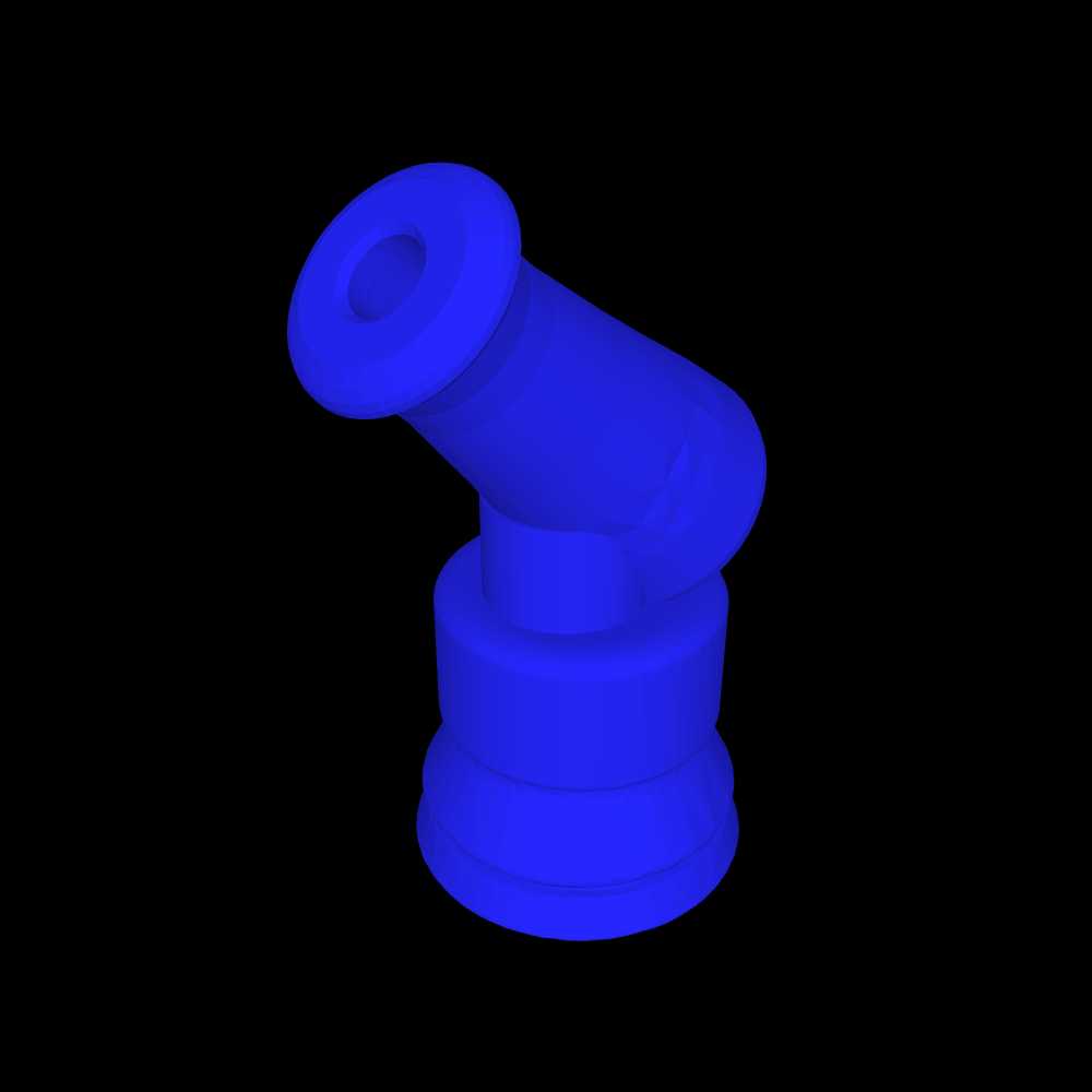
I have added new logos for the Darker color scheme. They feature a black cannon and a natural colored nightrider in the style of a winged horse. In the big logo on this page, the cannon was designed by Jean-Louis Cazaux and the nightrider by Bob Greenwade.
To find a specific piece, you can type the piece name and "chess" into the search bar. You'll get a limited number of possibilities, and the piece you want is most often in the last one under my name.
I followed the link to your thingiverse profile, but I didn't see all the pieces you have posted images of here in your comments. The closest I found to a Nightrider was the Zebrarider.
I figured out that you're packaging multiple pieces together, and I have to browse through each package to see them all.
 H. G. Muller wrote on Sat, Apr 20 06:28 PM UTC in reply to Fergus Duniho from 04:01 PM:
The coloring is very splotchy, though more so on curved surfaces than on flat surfaces, as can be seen in this color image of a color scan of my Likebook Mars:
Conventional solution for this problem is to apply 'dither' to the image: add white noise to the brightness of the individual pixels, randomly chosen from a homogeneous distribution that has the width of one brightness quantum.
And I'll get right on putting the link in my profile.
@Fergus: Here:
I think I can work with the 3dviewer.net website, but I don't have a link to Bob's thingiverse account. Considering how many 3D pieces he designs, it would be a good idea for him to include a link to it in his profile.
Yeah, it's the curves all right -- specifically, curves that are both horizontal and vertical.
There's not much to be done about that, unfortunately, mostly because I don't have many pieces (almost none, in fact) that don't have that feature. Either you'll have to use just the Nightrider, or Lifebook Mars users will just have to deal.
I can try to find some pieces of that sort, like the Vivi and Double Cross, but there aren't going to be many.
That said, I really like the brown ones in full-color mode.
Hopefully, brown works at least a little better.
It doesn't. The coloring is very splotchy, though more so on curved surfaces than on flat surfaces, as can be seen in this color image of a color scan of my Likebook Mars:

I was just thinking that it might be time to take a break and let Fergus address the issue you and (IIRC) David are having.
Also. Anybody hears us?!
I don't have a Likebook Mars, so I don't know what you mean.
It is an Android tablet with an eink display intended primarily for reading. The important thing you need to know is that it displays everything in black and white eink, which has even fewer gradations of grey than a grey monochrome image on an LCD monitor would have. Since I made the Darker color scheme for use with it, I am testing how the images intended for this color scheme look on it.
I just uploaded wood-brown versions of everything, plus four new pieces.


Hopefully, brown works at least a little better.
"I just looked at these pieces on my Likebook Mars, and they fade into the background too much on it."
I don't have a Likebook Mars, so I don't know what you mean.
I think you're right about the shapes making the difference. I think I'll try them in a medium brown (I'd go for tan, but apparently I'm the Black player), and maybe add a couple of angular pieces.
@ Fergus: well, it's a bit your fault Fergus. You asked both Bob and me and then it was not possible to understand that you were not speaking to both of us. About the color, I first understood that you wanted pieces on a blue background, so did Bob, then that you wanted blue pieces on a black background. If you prefer white pieces on a black background it is not a problem at all.
Actually, there is something VERY simple to do, a piece of cake for you. You go to:
https://www.thingiverse.com/kazo65/designs
There you can download the .stl of the piece you would like.
Then you open that .stl with:
And you can have a snapshot of that piece with the color you like, the background you like, the orientation you like, the size you like, etc.
If you can't do that and need help, please tell me exactly which piece/color/background you would like, I will make it for you.
I was comparing these on both my iPad and my Likebook Mars ereader, and on the latter, they all appear as grey on a black background. From the Thaumaturge on down, there are sharp contrasts between different shades of grey that look kind of random and ugly. I’m not sure if the horse shape of the first few pieces just leads to a more pleasing shading or if you did something different in the pieces following them, though I suspect it is the shape that makes the difference.
I also face this problem and cannot submit new pages…)
I wasn’t expecting either of you to change the color of your pieces. I envision the logo as having a white piece supplied by you and a blue piece supplied by Bob.
Additionally, I just looked at these pieces on my Likebook Mars, and they fade into the background too much on it.
@Bob: I have used this on-line viewer which is working very nice. I recommend, you can easily change the background, the color of the piece, the size of the snapshot, etc.


Here the images you asked Fergus. The blue might be too saturated.
@ Fergus: I have made images of some of my 3D pieces in blue on black background. I wished to upload the images but I lack space to do it. So I wanted to create a fake page named "Cazaux Vault" to get some room where to upload but I get this message:
"As a veteran contributor with nine or more submissions published so far, you are limited to submitting nine of your games for review and publication at a time. If you would like to post more, cooperate with the editors to get your submissions accepted, or revert something to a work-in-progress and submit something else."
What is this? I don't have 9 games in waiting!?
Does that mean I cannot create any new page?
Hold off on that Midnighter; I need to update it with better wings.
Here are the requested pieces (some are overwritten from before, so you may need to flush the cache):


I'd suggest using only one Knight variant and only one moon-topped piece in the lineup; offhand I'd choose the Midnighter and Thaumaturge.
And a few others, sorted roughly in order of importance to include (as I see things, anyway):


I meant a blue piece on a black background.
Ah, OK. I'll do that with all of the pieces you asked for (plus a couple others) this evening. (Right now it's time for me to log off for a while.)
Mostly Jean-Louis, since mine's (still) broken.
I meant a blue piece on a black background.
I would add another criteria: the 3D piece which is represented should be realistically 3D-printable and not too fragile.
I would presume that anyone who makes 3D pieces is already keeping that one in mind. Since I don't have a 3D printer to test pieces with myself, I will leave it up to you and Bob to judge whether your pieces fit this criterion.
OK, well, here's my shot at a Nightrider image. If this works for you, I'll get to others tonight and/or tomorrow.
So, should I use #0000FF or another shade of blue?
Whatever you have been using is fine, or you could use the same color as the Alfaerie pieces use, which is #5984BD.
I was thinking, in keeping with the row of figures across the bottom of the Light-themed logo, to make the pieces different colors (nothing outrageous; mainly ivory, tan, grey, muted red, that sort of thing that you might see in an actual chess set).
While the Darker scheme can be used on monitors, tablets, and phones, I designed it mainly for monochrome eink displays, and my Likebook Mars eink device renders red as black. So colors with mostly red will not work out well on that or similar devices. Since blue is used for the Alfaerie pieces and shows up well on my Likebook Mars, I figured it would be a good choice.
I figure to leave any resizing and cropping to your (probably more capable) hands.
I suppose if I resize it against a black background, it will look fine.
I'm opening the STL files in Paint 3D. Using the 3D view, make the canvas visible and expand it to 8000x6000, and it can be any color desired with the paintcan "fill" function (as can the piece itself).
@Bob: which viewer or software do you use to get those images? Blender? or something else, maybe more friendly?
I agree with your 2) and 3), especially 3). Unfortunately I never made any Nightrider so far. This because I don't like leaper-runners which are difficult to predict on board. But I might do one, one day, as well as the Grasshopper.
I would add another criteria: the 3D piece which is represented should be realistically 3D-printable and not too fragile.
This is for the Darker color scheme, which has a black background. Blue will be fine, since it shows up well against black, and it contrasts with another piece being white.
So, should I use #0000FF or another shade of blue?
I was thinking, in keeping with the row of figures across the bottom of the Light-themed logo, to make the pieces different colors (nothing outrageous; mainly ivory, tan, grey, muted red, that sort of thing that you might see in an actual chess set).
I figure to leave any resizing and cropping to your (probably more capable) hands.
That worked
I think I fixed the conditional. So try it again.
I'm trying to change the visibility of this page to members-only from private, but it says "you are limited to submitting nine of your games for review and publication at a time" and fails even though I only see that I have two submissions for review. Is the submissions for review page not showing everything?
This is for the Darker color scheme, which has a black background. Blue will be fine, since it shows up well against black, and it contrasts with another piece being white. The tallest piece in the Dark scheme's logo is 427, and the height of the logo is 432. Without the pieces, the text part of the logo has a height of 415. If I do like I did with the Light logo, a piece height of 285 would work.
I wasn't sure what you'd want/be able to use as far as piece and background colors, so I just played with it a little. I can change them as desired.
Here's the Midnighter and Thaumaturge, for starters.
And I still do like my Phoenix.

I'll get the others you asked about later in the day, once I know your color preferences (other than being careful with reds).
Let's try the cannon, the chancellor, the dragon king, and the phoenix.
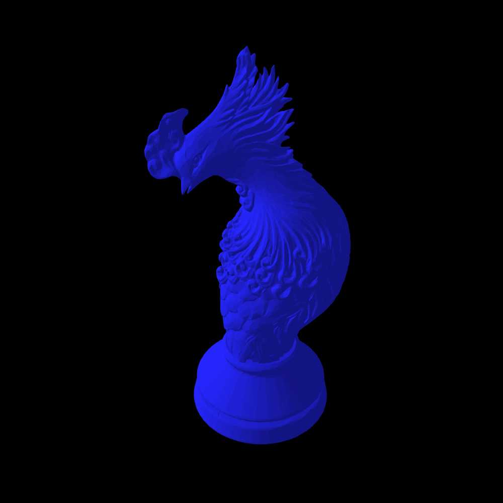
The main reasons I'm interested in a Nightrider are that (1) it fits a nocturnal theme, (2) it resembles a regular Chess piece enough that someone could recognize it as a Chess variant piece if they saw it out of context, and (3) it is one of the better known fairy chess pieces. Some other pieces of yours that might work for the first two reasons are Midnighter, Moonrider, Thaumaturge, and Luna Pawn. So I would be interested in seeing these with a neutral background too.
My Nightrider and Bodyguard, as promised:
Since Lev mentioned them, the Zip and Torch:
And, just for giggles, my Grandmaster Mage and Anvil:

I can set about making the neutral-background pieces just about any color you want, if there's a preference. I'll assume want just the first two unless you say otherwise (though I may do them all just for the heck of it).
Maybe Archbishop and (sorry but I just suggest) my Zip or (better) Torch?
Both these my pieces have 3D models made by Bob.
@ Fergus: I can make an image of any 3D piece without any background. Just tell me which one from here if you want to make a test:
https://www.chessvariants.com/craft/a-catalog-of-3d-printable-chess-variant-pieces
Of course, that can be done with Bob's pieces as well.
I do have a Nightrider, though given a choice my favorite piece that I've designed has been a Bodyguard.
I'll link the Thingiverse images of both tomorrow morning, and probably make neutral-background images as well.
I'm thinking of making a logo specifically for the Darker color scheme using piece designs for 3D printers. However, I want to use images without a background behind them, and I think it would be appropriate to include a Nightrider, though it doesn't look like anyone has made one. Since Bob Greenwade and Jean-Louis Cazaux are the most active in making such pieces, one piece from each might be appropriate. What ideas do you guys have?
I have now updated Mobile Detect to 4.8.06. Since it works differently than the old version, mobile detection was a bit wonky until I got it working correctly.
That's now corrected.
I see
And maybe you’ll make text in brown dark mode if not whiter but bit brighter?
Yes, the saving worked, but when writing the form on mobile, it was using the wrong condition to add " SELECTED" to the darker option. That's now corrected.
Ah, forgot to say. Color scheme changes’ saving doesn’t work!
No, it works, but sets darker mode when turning to dark and vice-versa.
I have updated PHP to 8.1.28, and I will be going over the error logs for things I have to change to keep up with this new version. If anything stops working, let me know.
For me, light brown text in brown Dark mode is significantly less readable.
That's going to vary with the device and the person. That's why there is now a third color scheme.
For me, light brown text in brown Dark mode is significantly less readable. And comments’ text is still white and readable.
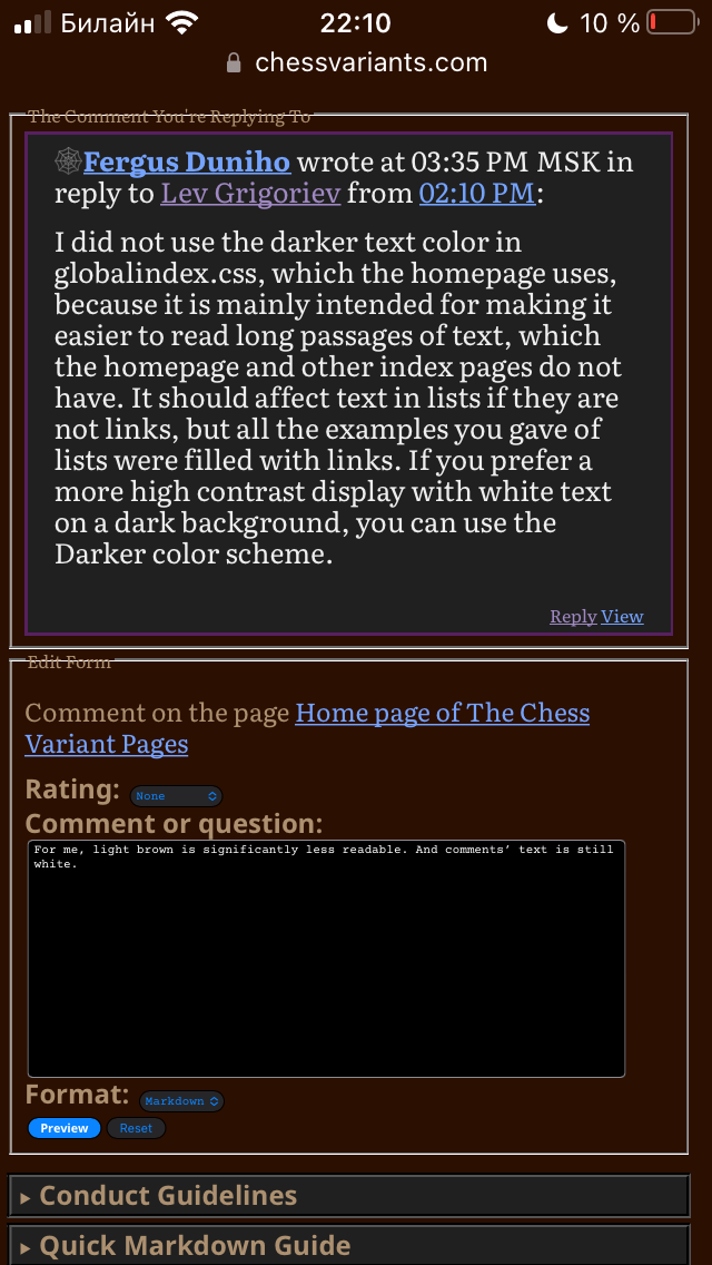
I did not use the darker text color in globalindex.css, which the homepage uses, because it is mainly intended for making it easier to read long passages of text, which the homepage and other index pages do not have. It should affect text in lists if they are not links, but all the examples you gave of lists were filled with links. If you prefer a more high contrast display with white text on a dark background, you can use the Darker color scheme.
And now in brown Dark mode text is light-brown instead of white!!!
However, main page and lists are not disturbed. It means that then entire site will work normally.
I modified the Dark color scheme to use a darker color for the text that works well with the chocolate background color. This is to make reading more comfortable on brightly lit screens. However, it was too low contrast on my Likebook Mars.
So I have added a new high contrast color scheme called Darker, represented by the New Moon emoji in the color scheme selection form. This is intended mainly for eink devices for which the Dark color scheme may be too low contrast, though you may still use it on other devices if you prefer it. In general, its background colors are darker, and its text colors are lighter. For the main background and text, it uses black and white. Unlike the Light and Dark color schemes, this one is not available through your browser settings. It is available only by selecting it on the website, and you may have to refresh your cache before it starts working.
I have made the controls for changing the color scheme more accessible. They appear on the right of the menubar in desktop mode, and they appear at the bottom of the menu on mobile devices.
Perfect!
Could I have the ItemID of this page changed to match the changed title?
My iPad has iOS 17.4.1, but I do have access to an old iPhone with iOS 15.8.2. The dark scheme partially works on it, but I see that the logo is not changing. It shows the elephant and unicorn logos instead of the dragon horse and (fairy) princess logos even when it is in dark mode. By substituting an older CSS file in index.html, I could tell that color-mix was not working, and blue but especially indigo did not contrast well with the dark background. I found this iPhone had the same problems in both Firefox and Chrome. At least using custom properties instead of color-mix has fixed the problem with the link text color.
To get the logo to change, I tried using the <picture> tag. As I feared, it would not work unless dark mode was selected at the browser level. This is why I normally use CSS to switch the logo. Chrome and Safari did not provide me any means to select dark mode at the browser level, though Firefox did. But when I selected dark mode in Firefox at the browser level, it wasn't working. Using test pages, I got it to work for browser selected dark mode by removing a test using :not. But doing this disabled the ability to select the light scheme from the menu when the browser's dark mode is turned on. I tried to fix this, and while my fix works on my desktop, it does not work in the Firefox app on this iPhone. So, I have no solution for getting the right logo to show up on this older iPhone that would work equally well with both methods of selecting the color scheme.
Well, it seems to be working fine for me now. :) Thanks!
I temporarily made myself the co-author of one of your pages to get the link you get for editing the page. I had introduced a new line using the variable $type, but the rest of the script was using $itemtype for the value of Type. So I changed the variable name, and it started working correctly.
Oh yeah, main and listing pages are fine. They’re the first pages which bring changes.
So, first, I would like you to report to me which version of which browser on which operating system or device has this problem. Then I would like you to make sure everything is up-to-date.
Safari. iOS 15.8.2 is the latest available for my device.
Analogically. For any my submission.
Works-in-progress:
Tifinagh Soup
Dai Dai Kagamigi
Unnecessarily Complicated Chess on a Tesseract
Greater Dragon Wars
Drunken (K)nights
Awaiting Review:
Unnecessarily Complicated Chess
Monster Mash
Xodohtro Chess (formerly Unorthodox Chess)
I haven't checked my already-published games yet, but since only one game page of the above two types (Clue Chess) isn't experiencing this, I think it's likely happening with them too. In other words, a system-wide problem.
Both of you, please list specific pages this is a problem on.
I have two unfinished submissions, but when I try to edit either of them I see "Since this is not a Game Rules page, please move any content here to the top section."
They are both meant to be Game Rules pages, so could someone fix that?
I'm getting the same thing on several of my pages.
I have two unfinished submissions, but when I try to edit either of them I see "Since this is not a Game Rules page, please move any content here to the top section."
They are both meant to be Game Rules pages, so could someone fix that?
I also changed the color for the vertical bar on blockquotes to the same color to match.
Since I didn't like how light this was in the light scheme, I considered other colors than darkkhaki for --nav-highlight-color, but I kept coming back to darkkhaki for that. So instead I looked for another custom property to use for the color of the vertical bar, and after trying out currentColor, I settled on --visited-link-color. I like how it stands out in each color scheme, and previous comments usually share the feature with visited links of being previously read.
I made the following changes to the color schemes:
- I replaced the uses of color-mix for the link colors with custom properties using values calculated by color-mix in Firefox. For the dark scheme, these are equal mixes of white with blue, indigo, or green, the same as they were before. For the light scheme, the mixes used 75% blue, indigo, or green and 25% black, as the equal mixes seemed too dark, and the unmodified colors seemed too bright.
- For comments, I changed the color of the line for displaying a page title from --nav-border-color to --nav-highlight-color, as olive was giving me a queasy feeling in combination with the link colors in the light scheme.
- I also changed the color for the vertical bar on blockquotes to the same color to match.
- For the dark scheme, I switched the values for --nav-border-color and --nav-highlight-color. This returns the two things mentioned above to the color they were before. Since the new nav highlight color is now lighter, it is standing out better against dark backgrounds.
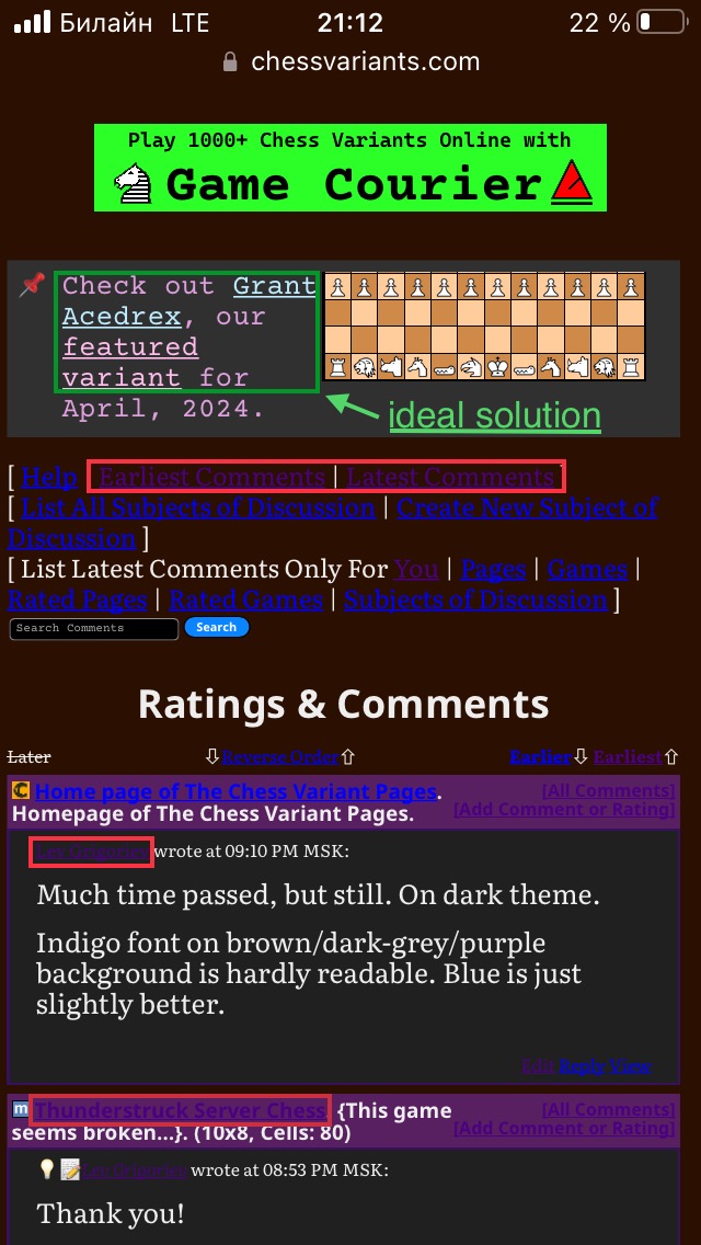
Much time passed, but still. On dark theme.
Indigo font on brown/dark-grey/purple background is hardly readable. Blue is just slightly better.
It's not like I've known this to be a problem and have just done nothing about it. Different browsers have different capabilities, and if what seems like an obvious problem to you goes on for a long time without being fixed, this could be because I am not experiencing the same problem as you are.
This particular problem is probably because I am using color-mix for the link colors instead of custom properties like I am for all the other color changes, and custom properties have better support than color-mix. So there may be an occasional browser that supports custom properties without supporting color-mix. However, I have not been able to locate one. While I have some old devices with old browsers that do not even support dark mode, every browser I have found to support dark mode supports it fully with both custom properties and color-mix.
So, first, I would like you to report to me which version of which browser on which operating system or device has this problem. Then I would like you to make sure everything is up-to-date. Make sure that your device is fully updated and that your browser is the latest version. After doing this, let me know whether the problem persists.
Much time passed, but still. On dark theme.
Indigo font on brown/dark-grey/purple background is hardly readable. Blue is just slightly better.
I suggest dividing font colors for light and dark modes further. Links’ colors in info boxes are possible solution.
What I know is that Fairy chess is a term that we use in // to chess variant or non orthodox chess, etc. It doesn't mean a chess with fairies. I know plenty chess variants, I know none with fairies.
As a fairy, it's a symbolic representation of fairy chess in general, not a literal representation of a particular fairy piece. As a princess, though, it is a literal representation of a particular fairy piece, and the fairy wings help indicate that this is the princess of fairy chess rather than the princess of Jetan or some other game with a princess. They also serve the purpose of distinguishing this piece from a queen, since the pieces flanking the logo should resemble usual Chess pieces without being mistaken for them.
Fairies or princesses, I'm not going to spend time to discuss Disney movies. Everyone has got what I meant, the rough idea. When my daughter was <8 years she was playing with little fairies or princesses some wings.
One thing I appreciate about this logo is how it balances the masculine and the feminine. The dragon horse is fiercely masculine, and the princess is gently feminine in a way that helps tame the ferocity of the dragon horse. While it is natural for little girls to be more into feminine things like princesses and fairies than boys are, it is also natural for men to appreciate what is feminine. It has become a cliche for both knights and dragons to be into princesses, and John Carter, a masculine pulp fiction hero, is known for his devotion to Dejah Thoris, a princess of Mars. As a straight male, I find that femininity is something I like about women, and it is something I want to see in the portrayal of a female Chess variant piece. Also, perhaps because I grew up with Brian Froud's Faeries book, I have long had an appreciation for fairies that has nothing to do with Tinkerbell. Disney may do what it can to capitalize on the love little girls have for fairies and princesses, but it does not have a monopoly on either concept, and I have not drawn on Disney representations to create this piece image.
And I know what a centaur is.
I never meant to imply otherwise. I was just pointing out the difficulty in portraying one in something short of a figurine piece.
I even took the challenge to represent one in 3D with the bottom of a knight and the top of warrior. My result is not a cute as your figurine but at least it looks like a chess piece in the same manner that a Staunton knight looks as a chess piece and not as a horseman figurine.
I look forward to seeing what is looks like when you create a page for your pieces. Things are now set up that you should now be able to do so. But let me know if you need to upload file formats that are not currently supported, as I remain unfamiliar with file formats for 3D printers and have not yet included support for uploading them in the File Manager.
you never change your mind
I do change my mind, and you even helped persuade me to remove the frog and an earlier fairy princess. But there are also matters on which I will stand my ground.
Awesome! Good job!
I think it might be helpful to have a form specifically designed for these more "generic" pages.
I have updated the submission scripts to handle other types of pages. This can be done with the Type field, which now includes all types. When its value is something other than Game, it provides only the first text field, which is normally used for the Introduction of a game. This field now has the database type of LONGTEXT instead of TEXT, which should be more than enough space for any file.
100 comments displayed
Permalink to the exact comments currently displayed.
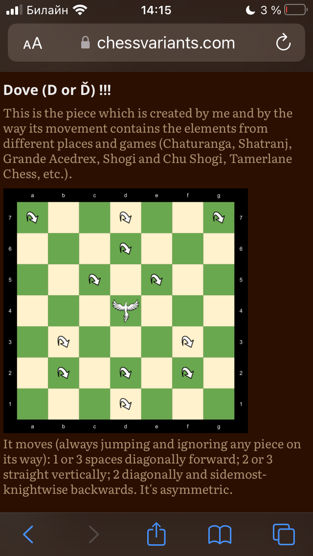
You can differ them:
BTW I have recently done the rules page.