Comments/Ratings for a Single Item
Awesome! Good job!
you never change your mind
I do change my mind, and you even helped persuade me to remove the frog and an earlier fairy princess. But there are also matters on which I will stand my ground.
What I know is that Fairy chess is a term that we use in // to chess variant or non orthodox chess, etc. It doesn't mean a chess with fairies. I know plenty chess variants, I know none with fairies.
As a fairy, it's a symbolic representation of fairy chess in general, not a literal representation of a particular fairy piece. As a princess, though, it is a literal representation of a particular fairy piece, and the fairy wings help indicate that this is the princess of fairy chess rather than the princess of Jetan or some other game with a princess. They also serve the purpose of distinguishing this piece from a queen, since the pieces flanking the logo should resemble usual Chess pieces without being mistaken for them.
Fairies or princesses, I'm not going to spend time to discuss Disney movies. Everyone has got what I meant, the rough idea. When my daughter was <8 years she was playing with little fairies or princesses some wings.
One thing I appreciate about this logo is how it balances the masculine and the feminine. The dragon horse is fiercely masculine, and the princess is gently feminine in a way that helps tame the ferocity of the dragon horse. While it is natural for little girls to be more into feminine things like princesses and fairies than boys are, it is also natural for men to appreciate what is feminine. It has become a cliche for both knights and dragons to be into princesses, and John Carter, a masculine pulp fiction hero, is known for his devotion to Dejah Thoris, a princess of Mars. As a straight male, I find that femininity is something I like about women, and it is something I want to see in the portrayal of a female Chess variant piece. Also, perhaps because I grew up with Brian Froud's Faeries book, I have long had an appreciation for fairies that has nothing to do with Tinkerbell. Disney may do what it can to capitalize on the love little girls have for fairies and princesses, but it does not have a monopoly on either concept, and I have not drawn on Disney representations to create this piece image.
And I know what a centaur is.
I never meant to imply otherwise. I was just pointing out the difficulty in portraying one in something short of a figurine piece.
I even took the challenge to represent one in 3D with the bottom of a knight and the top of warrior. My result is not a cute as your figurine but at least it looks like a chess piece in the same manner that a Staunton knight looks as a chess piece and not as a horseman figurine.
I look forward to seeing what is looks like when you create a page for your pieces. Things are now set up that you should now be able to do so. But let me know if you need to upload file formats that are not currently supported, as I remain unfamiliar with file formats for 3D printers and have not yet included support for uploading them in the File Manager.
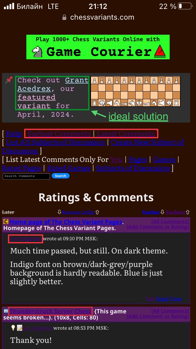
Much time passed, but still. On dark theme.
Indigo font on brown/dark-grey/purple background is hardly readable. Blue is just slightly better.

I suggest dividing font colors for light and dark modes further. Links’ colors in info boxes are possible solution.
Much time passed, but still. On dark theme.
Indigo font on brown/dark-grey/purple background is hardly readable. Blue is just slightly better.
It's not like I've known this to be a problem and have just done nothing about it. Different browsers have different capabilities, and if what seems like an obvious problem to you goes on for a long time without being fixed, this could be because I am not experiencing the same problem as you are.
This particular problem is probably because I am using color-mix for the link colors instead of custom properties like I am for all the other color changes, and custom properties have better support than color-mix. So there may be an occasional browser that supports custom properties without supporting color-mix. However, I have not been able to locate one. While I have some old devices with old browsers that do not even support dark mode, every browser I have found to support dark mode supports it fully with both custom properties and color-mix.
So, first, I would like you to report to me which version of which browser on which operating system or device has this problem. Then I would like you to make sure everything is up-to-date. Make sure that your device is fully updated and that your browser is the latest version. After doing this, let me know whether the problem persists.
I made the following changes to the color schemes:
- I replaced the uses of color-mix for the link colors with custom properties using values calculated by color-mix in Firefox. For the dark scheme, these are equal mixes of white with blue, indigo, or green, the same as they were before. For the light scheme, the mixes used 75% blue, indigo, or green and 25% black, as the equal mixes seemed too dark, and the unmodified colors seemed too bright.
- For comments, I changed the color of the line for displaying a page title from --nav-border-color to --nav-highlight-color, as olive was giving me a queasy feeling in combination with the link colors in the light scheme.
- I also changed the color for the vertical bar on blockquotes to the same color to match.
- For the dark scheme, I switched the values for --nav-border-color and --nav-highlight-color. This returns the two things mentioned above to the color they were before. Since the new nav highlight color is now lighter, it is standing out better against dark backgrounds.
I also changed the color for the vertical bar on blockquotes to the same color to match.
Since I didn't like how light this was in the light scheme, I considered other colors than darkkhaki for --nav-highlight-color, but I kept coming back to darkkhaki for that. So instead I looked for another custom property to use for the color of the vertical bar, and after trying out currentColor, I settled on --visited-link-color. I like how it stands out in each color scheme, and previous comments usually share the feature with visited links of being previously read.
I have two unfinished submissions, but when I try to edit either of them I see "Since this is not a Game Rules page, please move any content here to the top section."
They are both meant to be Game Rules pages, so could someone fix that?
I have two unfinished submissions, but when I try to edit either of them I see "Since this is not a Game Rules page, please move any content here to the top section."
They are both meant to be Game Rules pages, so could someone fix that?
I'm getting the same thing on several of my pages.
Both of you, please list specific pages this is a problem on.
Works-in-progress:
Tifinagh Soup
Dai Dai Kagamigi
Unnecessarily Complicated Chess on a Tesseract
Greater Dragon Wars
Drunken (K)nights
Awaiting Review:
Unnecessarily Complicated Chess
Monster Mash
Xodohtro Chess (formerly Unorthodox Chess)
I haven't checked my already-published games yet, but since only one game page of the above two types (Clue Chess) isn't experiencing this, I think it's likely happening with them too. In other words, a system-wide problem.
Analogically. For any my submission.
So, first, I would like you to report to me which version of which browser on which operating system or device has this problem. Then I would like you to make sure everything is up-to-date.
Safari. iOS 15.8.2 is the latest available for my device.
Oh yeah, main and listing pages are fine. They’re the first pages which bring changes.
I temporarily made myself the co-author of one of your pages to get the link you get for editing the page. I had introduced a new line using the variable $type, but the rest of the script was using $itemtype for the value of Type. So I changed the variable name, and it started working correctly.
Well, it seems to be working fine for me now. :) Thanks!
My iPad has iOS 17.4.1, but I do have access to an old iPhone with iOS 15.8.2. The dark scheme partially works on it, but I see that the logo is not changing. It shows the elephant and unicorn logos instead of the dragon horse and (fairy) princess logos even when it is in dark mode. By substituting an older CSS file in index.html, I could tell that color-mix was not working, and blue but especially indigo did not contrast well with the dark background. I found this iPhone had the same problems in both Firefox and Chrome. At least using custom properties instead of color-mix has fixed the problem with the link text color.
To get the logo to change, I tried using the <picture> tag. As I feared, it would not work unless dark mode was selected at the browser level. This is why I normally use CSS to switch the logo. Chrome and Safari did not provide me any means to select dark mode at the browser level, though Firefox did. But when I selected dark mode in Firefox at the browser level, it wasn't working. Using test pages, I got it to work for browser selected dark mode by removing a test using :not. But doing this disabled the ability to select the light scheme from the menu when the browser's dark mode is turned on. I tried to fix this, and while my fix works on my desktop, it does not work in the Firefox app on this iPhone. So, I have no solution for getting the right logo to show up on this older iPhone that would work equally well with both methods of selecting the color scheme.
Perfect!
Could I have the ItemID of this page changed to match the changed title?
I have made the controls for changing the color scheme more accessible. They appear on the right of the menubar in desktop mode, and they appear at the bottom of the menu on mobile devices.
I modified the Dark color scheme to use a darker color for the text that works well with the chocolate background color. This is to make reading more comfortable on brightly lit screens. However, it was too low contrast on my Likebook Mars.
So I have added a new high contrast color scheme called Darker, represented by the New Moon emoji in the color scheme selection form. This is intended mainly for eink devices for which the Dark color scheme may be too low contrast, though you may still use it on other devices if you prefer it. In general, its background colors are darker, and its text colors are lighter. For the main background and text, it uses black and white. Unlike the Light and Dark color schemes, this one is not available through your browser settings. It is available only by selecting it on the website, and you may have to refresh your cache before it starts working.
And now in brown Dark mode text is light-brown instead of white!!!


However, main page and lists are not disturbed. It means that then entire site will work normally.
I did not use the darker text color in globalindex.css, which the homepage uses, because it is mainly intended for making it easier to read long passages of text, which the homepage and other index pages do not have. It should affect text in lists if they are not links, but all the examples you gave of lists were filled with links. If you prefer a more high contrast display with white text on a dark background, you can use the Darker color scheme.
25 comments displayed
Permalink to the exact comments currently displayed.
I have updated the submission scripts to handle other types of pages. This can be done with the Type field, which now includes all types. When its value is something other than Game, it provides only the first text field, which is normally used for the Introduction of a game. This field now has the database type of LONGTEXT instead of TEXT, which should be more than enough space for any file.