Comments by Fergus Duniho
I would add another criteria: the 3D piece which is represented should be realistically 3D-printable and not too fragile.
I would presume that anyone who makes 3D pieces is already keeping that one in mind. Since I don't have a 3D printer to test pieces with myself, I will leave it up to you and Bob to judge whether your pieces fit this criterion.
So, should I use #0000FF or another shade of blue?
Whatever you have been using is fine, or you could use the same color as the Alfaerie pieces use, which is #5984BD.
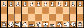
I was thinking, in keeping with the row of figures across the bottom of the Light-themed logo, to make the pieces different colors (nothing outrageous; mainly ivory, tan, grey, muted red, that sort of thing that you might see in an actual chess set).
While the Darker scheme can be used on monitors, tablets, and phones, I designed it mainly for monochrome eink displays, and my Likebook Mars eink device renders red as black. So colors with mostly red will not work out well on that or similar devices. Since blue is used for the Alfaerie pieces and shows up well on my Likebook Mars, I figured it would be a good choice.
I figure to leave any resizing and cropping to your (probably more capable) hands.
I suppose if I resize it against a black background, it will look fine.
I think I fixed the conditional. So try it again.
This is for the Darker color scheme, which has a black background. Blue will be fine, since it shows up well against black, and it contrasts with another piece being white. The tallest piece in the Dark scheme's logo is 427, and the height of the logo is 432. Without the pieces, the text part of the logo has a height of 415. If I do like I did with the Light logo, a piece height of 285 would work.
Let's try the cannon, the chancellor, the dragon king, and the phoenix.
The main reasons I'm interested in a Nightrider are that (1) it fits a nocturnal theme, (2) it resembles a regular Chess piece enough that someone could recognize it as a Chess variant piece if they saw it out of context, and (3) it is one of the better known fairy chess pieces. Some other pieces of yours that might work for the first two reasons are Midnighter, Moonrider, Thaumaturge, and Luna Pawn. So I would be interested in seeing these with a neutral background too.
I'm thinking of making a logo specifically for the Darker color scheme using piece designs for 3D printers. However, I want to use images without a background behind them, and I think it would be appropriate to include a Nightrider, though it doesn't look like anyone has made one. Since Bob Greenwade and Jean-Louis Cazaux are the most active in making such pieces, one piece from each might be appropriate. What ideas do you guys have?
Since the fairychess include file uses a shortcode to display pieces, I changed how the shortcode works instead of any code in the fairychess include file. I modified it to include WIDTH and HEIGHT values in the IMG tag when the image is an SVG image. These will be equal to $width and $height when these variables have values, as they usually do in Game Courier, and they will be 50 otherwise.
I have now updated Mobile Detect to 4.8.06. Since it works differently than the old version, mobile detection was a bit wonky until I got it working correctly.
Yes, the saving worked, but when writing the form on mobile, it was using the wrong condition to add " SELECTED" to the darker option. That's now corrected.
I have updated PHP to 8.1.28, and I will be going over the error logs for things I have to change to keep up with this new version. If anything stops working, let me know.
For me, light brown text in brown Dark mode is significantly less readable.
That's going to vary with the device and the person. That's why there is now a third color scheme.
I did not use the darker text color in globalindex.css, which the homepage uses, because it is mainly intended for making it easier to read long passages of text, which the homepage and other index pages do not have. It should affect text in lists if they are not links, but all the examples you gave of lists were filled with links. If you prefer a more high contrast display with white text on a dark background, you can use the Darker color scheme.
The inside part should be colored #f9f9f9. Using the background color for inside the piece makes it transparent and impossible to recolor properly.
I modified the Dark color scheme to use a darker color for the text that works well with the chocolate background color. This is to make reading more comfortable on brightly lit screens. However, it was too low contrast on my Likebook Mars.
So I have added a new high contrast color scheme called Darker, represented by the New Moon emoji in the color scheme selection form. This is intended mainly for eink devices for which the Dark color scheme may be too low contrast, though you may still use it on other devices if you prefer it. In general, its background colors are darker, and its text colors are lighter. For the main background and text, it uses black and white. Unlike the Light and Dark color schemes, this one is not available through your browser settings. It is available only by selecting it on the website, and you may have to refresh your cache before it starts working.
I have made the controls for changing the color scheme more accessible. They appear on the right of the menubar in desktop mode, and they appear at the bottom of the menu on mobile devices.
I am not sure where these set files are stored,
They are stored in
/home/chessvariants/public_html/play/pbm/sets/
nor am I sure how to upload the new versions to the site.
Do you know how to use SCP or SFTP? Do you still have the passwords I sent you by email?
My iPad has iOS 17.4.1, but I do have access to an old iPhone with iOS 15.8.2. The dark scheme partially works on it, but I see that the logo is not changing. It shows the elephant and unicorn logos instead of the dragon horse and (fairy) princess logos even when it is in dark mode. By substituting an older CSS file in index.html, I could tell that color-mix was not working, and blue but especially indigo did not contrast well with the dark background. I found this iPhone had the same problems in both Firefox and Chrome. At least using custom properties instead of color-mix has fixed the problem with the link text color.
To get the logo to change, I tried using the <picture> tag. As I feared, it would not work unless dark mode was selected at the browser level. This is why I normally use CSS to switch the logo. Chrome and Safari did not provide me any means to select dark mode at the browser level, though Firefox did. But when I selected dark mode in Firefox at the browser level, it wasn't working. Using test pages, I got it to work for browser selected dark mode by removing a test using :not. But doing this disabled the ability to select the light scheme from the menu when the browser's dark mode is turned on. I tried to fix this, and while my fix works on my desktop, it does not work in the Firefox app on this iPhone. So, I have no solution for getting the right logo to show up on this older iPhone that would work equally well with both methods of selecting the color scheme.
I temporarily made myself the co-author of one of your pages to get the link you get for editing the page. I had introduced a new line using the variable $type, but the rest of the script was using $itemtype for the value of Type. So I changed the variable name, and it started working correctly.
Both of you, please list specific pages this is a problem on.
I also changed the color for the vertical bar on blockquotes to the same color to match.
Since I didn't like how light this was in the light scheme, I considered other colors than darkkhaki for --nav-highlight-color, but I kept coming back to darkkhaki for that. So instead I looked for another custom property to use for the color of the vertical bar, and after trying out currentColor, I settled on --visited-link-color. I like how it stands out in each color scheme, and previous comments usually share the feature with visited links of being previously read.
I made the following changes to the color schemes:
- I replaced the uses of color-mix for the link colors with custom properties using values calculated by color-mix in Firefox. For the dark scheme, these are equal mixes of white with blue, indigo, or green, the same as they were before. For the light scheme, the mixes used 75% blue, indigo, or green and 25% black, as the equal mixes seemed too dark, and the unmodified colors seemed too bright.
- For comments, I changed the color of the line for displaying a page title from --nav-border-color to --nav-highlight-color, as olive was giving me a queasy feeling in combination with the link colors in the light scheme.
- I also changed the color for the vertical bar on blockquotes to the same color to match.
- For the dark scheme, I switched the values for --nav-border-color and --nav-highlight-color. This returns the two things mentioned above to the color they were before. Since the new nav highlight color is now lighter, it is standing out better against dark backgrounds.
25 comments displayed
Permalink to the exact comments currently displayed.
I meant a blue piece on a black background.