Comments/Ratings for a Single Item
 H. G. Muller wrote on Sun, Jan 1, 2023 09:21 AM UTC in reply to Greg Strong from 12:58 AM:
So any posting of new default color schemes is completely inappropriate without first establishing a DEFINITION OF PROBLEM to be solved and a PROCESS for how changes are to be submitted and results are to be measured.
Well, since it seems that I am the one who raised this issue, let me formulate a formal definition of the problem:
I think the yellow/green/blue board colors that are the defaults of the Diagram Designer, although excellently suited for the main diagram in an article, are are to 'loud' for embedded diagrams in a comment (for which my imagined use case would be mainly to illustrate issues in specific positions). With this I mean they would attract more visual attention than they deserve, and thus would become a distraction.
Since we are creating a new feature here for general use, it seemed wise to give its design some serious thought rather than just slamming something together that happened to work. Color schemes were one of the aspects I identified as possible target for optimization. Note that in the context of the 'instant diagram' people are much less likely to customize it than when they use the DD through the design interface in its article, so defaults become a more important issue.
I would prefer somewhat softer colors for the board.
BTW, I consider the khaki/smoke theme presented in Fergus' latest posting excellent.
As to the process: it seems to me this is well under way. Everything said so far has been only a proposal, and all editors that have an opinion on this matter can chime in. I can add that w.r.t. other proposals I have made for improvement of this website, there has been disappointingly little interest from other editors in those.
I will anticipate the response: these changes are forward-only changes and have no effect on the existing content. Ok, while there is truth to that, the argument is insufficient. The only reason this forum has any value, (the only reason people are reading it), is because of the established content. And it only continues because a community drives it forwards. Almost no one would be here if it wasn't for our foundation. We stand on the shoulders of giants.
I am not sure what point you are trying to make. Why would creating new features diminish the value of this website? Why would the fact that designing it in a certain way would be the best way to do it be an 'insufficient argument'? I would say it is the only argument.
I had to post the previous comment before I could look at the two boards on my mobile devices. On these, the dark and light spaces contrast better on the darkkhaki/whitesmoke board. On the e-ink screen of my Likebook Mars, neither appears loud, and the spaces are shades of gray. On my Fire tablet, colors don't appear as bright as they do on my desktop monitor. So I don't find either to be too loud.
So any posting of new default color schemes is completely inappropriate without first establishing a DEFINITION OF PROBLEM to be solved
H. G. did this several comments ago by complaining that the colors were too loud. I added the criterion that the colors should generally reflect the olive/beige coloring used in tournament boards. H. G. also praised one of the color combinations I offered for how well the colors contrasted with each other. Let's look at some boards side-by-side and compare them on these criteria.
- With the change in pieces, the one on the left seems less loud than it did before, though it may still be louder than the one on the right.
- On my desktop at least, both seem to have high contrast. The yellow spaces on the left contrast very well with the blue pieces, and the green is bright enough that it contrasts well with the more subdued blue of Black's pieces. The dark khaki color is technically a yellow and it also contrasts well with the blue pieces. The white smoke color is different enough from the full white of the White pieces to contrast with them.
- The left board has green for dark spaces, and the yellow spaces may be accepted as a substitute for beige or white. The right board has off-white spaces, and its dark khaki spaces seem green when they aren't being compared directly to green. It also resembles the olive color more than it does other greens.
Greg Strong wrote on Sun, Jan 1, 2023 12:58 AM UTC in reply to Fergus Duniho from 12:25 AM:I object to the lack of process.
I will restate again, we have colors we have used for a very long time. They are not what I would choose, personally, but they have worked:
It's possible that these colors are what nobody still here would specifically choose, but they could still be a reasonable compromise. If we are going to make a change, then we need a DEFINED PROCESS. If we need a change, why, what are the criteria, and how are they to be judged? This is a long established forum, the results of which are the results of the free contributions of hundreds of people. Given that, we cannot make such sweeping changes just because one editor wants to.
I will anticipate the response: these changes are forward-only changes and have no effect on the existing content. Ok, while there is truth to that, the argument is insufficient. The only reason this forum has any value, (the only reason people are reading it), is because of the established content. And it only continues because a community drives it forwards. Almost no one would be here if it wasn't for our foundation. We stand on the shoulders of giants.
So any posting of new default color schemes is completely inappropriate without first establishing a DEFINITION OF PROBLEM to be solved and a PROCESS for how changes are to be submitted and results are to be measured.
I think those colors are too loud.
Which colors are you referring to?
Is this really necessary? We need to change the color scheme of comments just to get the color scheme you've decided we should have for board diagrams?
In a later comment than the one you're responding to, I indicated a preference for a different color combination that doesn't include beige. So, I am no longer thinking of changing the comment color to accommodate a board with beige spaces.
H. G. Muller wrote on Sun, Jan 1, 2023 12:20 AM UTC in reply to Greg Strong from Sat Dec 31 2022 11:32 PM:I think those colors are too loud. I would like colors with a somewhat lower saturation, so that the embedded diagrams don't draw all the attention.
Greg Strong wrote on Sat, Dec 31, 2022 11:32 PM UTC in reply to Fergus Duniho from 04:12 PM:I'm considering changing the comment background color to #FFFFF0 to match the ivory page background color. This would make it easier to use darkkhaki and beige for the diagram colors, since in my mobile tests, darkkhaki contrasts better with the pieces than olive or olivedrab do.
Is this really necessary? We need to change the color scheme of comments just to get the color scheme you've decided we should have for board diagrams? I think it would be appropriate to get some community feedback on what colors are desired before we start making far-reaching changes. I've heard nothing on why the standard board colors we've been using for 15+ years are no longer acceptable. And, if it's decided they should change, then we should vote on a replacement.
Greg Strong wrote on Sat, Dec 31, 2022 11:27 PM UTC in reply to Fergus Duniho from 09:30 PM:
;filter:url(#filter855)
Very interesting. This is similar to the code that was injected into the Chancellor that Jean-Louis reported that I can't explain. Perhaps we should just search the text for "filter:url" and get rid of all of that. Absolutely nothing I have done should involve hitting the web to load any filters. AFAIK my images should be nothing but local layers, paths and polygons.
Try InkScape. No reason to hack the SVG text directly if that's what you are doing.
I already did, and then I worked with the code directly. Writing SVG directly is better for the same reasons as writing HTML directly. It offers more control and precision.
I've also touched up the zebra.
 Greg Strong wrote on Sat, Dec 31, 2022 10:25 PM UTC in reply to Fergus Duniho from 06:05 PM:
Okay, I got the left and right x coordinates for the triangle's base and used these to match the lower base to it.
Try InkScape. No reason to hack the SVG text directly if that's what you are doing.
I finally fixed the Vao in Chromium-based browsers. Looking at the SVG code, the style code for the triangles included ;filter:url(#filter855) even though this filter was not defined anywhere in the SVG code. I removed it to see what effect it would have. The image in Firefox remained unchanged, and the image in Chrome, Edge, and Vivaldi all now showed the triangular base.
Since the triangular part of the Vao wasn't showing up on my Likebook Mars, I rewrote that part to use polygons instead of paths. While it's showing up in Firefox, the main issue was with Chrome, and this appears to be a Chromium-wide problem, as it is not displaying on Chrome, Edge, or Vivaldi on my desktop even when I have it display the local file from my computer. So, maybe switching from path to polygon didn't fix anything.
In both my desktop and my mobile devices, it looks like the combination of darkkhaki and whitesmoke has the best contrast all around, and it's similar enough to the green/white or olive/beige coloring common to many tournament Chess boards.
Okay, I got the left and right x coordinates for the triangle's base and used these to match the lower base to it.
I tweaked the Vao. I erased the corner of the rectangle sticking below the triangle, and I adjusted the width and positioning of the base to better align with the base of the triangle. It looks like it could use a little more adjusting, but I'll have to reread a bit to learn how to get the precise values to use.

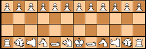
I'm considering changing the comment background color to #FFFFF0 to match the ivory page background color. This would make it easier to use darkkhaki and beige for the diagram colors, since in my mobile tests, darkkhaki contrasts better with the pieces than olive or olivedrab do. The left board shows the darkkhaki and beige board against an ivory background. The right board uses darkkhaki and whitesmoke.
Greg Strong wrote on Sat, Dec 31, 2022 02:09 AM UTC:I have converted 23 pieces from the Abstract Piece Set to SVG and placed them in /graphics.dir/abstractSVG. They should be extremely close to the originals. The geometric nature of them made it fairly easy to match most of them up exactly.


Greg Strong wrote on Sat, Dec 31, 2022 02:01 AM UTC in reply to H. G. Muller from Fri Dec 30 10:13 PM:Nice! Not high urgency, but it's nice to see the original pieces getting a renovation.
H. G. Muller wrote on Fri, Dec 30, 2022 10:13 PM UTC in reply to H. G. Muller from Thu Dec 29 09:03 PM:Some more 'small' SVG:


The first one proposed by Fergus also seemed to have good contrast
This is nice except that the light squares are exactly the same as the comment background, so they disappear into it, so it should have a border color.
I originally made it using the Abstract pieces, but now that I see it with the Alfaerie pieces, it seems to work better. I like how the square colors contrast well with each other while also contrasting well with the piece colors. It doesn't look too bad without a border, but since it does use the same color as the comment background, here are some alternatives that don't.
Greg Strong wrote on Fri, Dec 30, 2022 07:16 PM UTC in reply to H. G. Muller from 06:43 PM:I still don't see what was wrong with the square colors used by Zied's Board Painter
These are ok. Not crazy about it, but I can live with it.
The first one proposed by Fergus also seemed to have good contrast
This is nice except that the light squares are exactly the same as the comment background, so they disappear into it, so it should have a border color.
And as long as we are volunteering suggestions, this is what I use as the default in ChessV:
H. G. Muller wrote on Fri, Dec 30, 2022 06:43 PM UTC in reply to Greg Strong from 03:38 PM:I'm sorry, I don't like that one at all. I think it's too dark and I consider it quite unattractive.
I still don't see what was wrong with the square colors used by Zied's Board Painter. These are quite light:
The first one proposed by Fergus also seemed to have good contrast:
25 comments displayed
Permalink to the exact comments currently displayed.
Let me point out that shortcodes also work on member-submitted pages, which means this feature is not limited to comments. So, I'm not coming at this from the perspective that comments need different defaults than articles do.