Comments/Ratings for a Single Item
I have now moved test.php to drawdiagram.php. It now uses the $scale value while drawing the board instead of after it is already drawn. So, if you want to use it with oversized SVG pieces at a size that will still look good when displayed at different sizes, you can do it by setting the scale value. Values under 20 will be interpreted as raw multiples, and values above 20 or with a % at the end will be interpreted as percentages. So, scale=2, scale=200, and scale=200% should all have the same effect. While there are still some issues with this script, I did not notice any that were not already in drawdiagram.php.
I made some progress on this today. It helped that I figured out how to customize the color temperature on my monitor and change the color theme of my text editor. Now that I have a dark background with lower light levels, it's easier to stare at code. In test.php, I got scaling to work for tiled boards, and I got the file markers to show up properly for the grid shape, but there are still issues with displaying full board images.
I just remembered this morning that I was working on updating a copy of drawdiagram.php for the sake of using the scale value while drawing the board instead of after it was all drawn, and I got stuck in the section for using board images. Meanwhile, I made some further changes to the main drawdiagram.php script. Before I do anything else with this script, I will have to integrate the change to both versions.
 H. G. Muller wrote on Thu, Jan 5, 2023 07:46 AM UTC in reply to Fergus Duniho from 02:21 AM:
The file labels still seem to be positioned incorrectly.
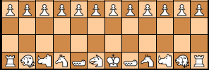
I've now gotten drawdiagram.php to accept a theme parameter. This will not work without the game parameter, and it may sometimes require the settings parameter. The theme parameter includes a theme file after the settings file, further modifying settings to conform to a specific theme. Here's one test run with the Motif-Wood theme for Chess.
I added some new parameters to drawdiagram.php. These are game and settings. When used together, the script will load a Game Courier settings file, and it will overwrite any value that is still set to a default value. This will allow you to use the fen shortcode to show diagrams for specific games without specifying all the particular details. When you use these two parameters, the fen shortcode will not add its own defaults to the query string. This will allow you to use the default values provided by the settings file instead. But you can override any value in a settings file by explicitly including a new value in the query string.
I've now changed the default to the green/white combination I posted last night. For the sake of contrasting with the blue pieces, I made the green brighter than the blue, and I gave it more red than blue. To better contrast with the white pieces and the beige background, I made the light squares an off-white that is darker than full white, and to better contrast with the blue pieces, I made the red and green components slightly higher than the blue component. But I avoided making it into a clear yellow, because the use of yellow generally added to the brightness of the board.
H. G. Muller wrote on Tue, Jan 3, 2023 06:07 PM UTC in reply to Jörg Knappen from 05:28 PM:Yep, good enough for me.
This green/white layout looks good and has no annoying flaws.
I have grown to hate the darkkhaki/whitesmoke board, mainly for the darkkhaki squares, which have begun to look like gold to me. They seem very bright and flashy, as well as less solid.
Here are the characteristics I think the default board should have:
- It should not be too loud, bright, or flashy.
- It should appear solid enough that it doesn't need a border.
- There should be good contrast between all the colors.
- It should generally follow a green/white color scheme
It was using ctype_lower, which checks whether every character is lowercase, and these had numerals in them. So, I replaced ctype_lower with my own function haslower, which checks whether any character in a string is lowercase.
Greg Strong wrote on Mon, Jan 2, 2023 08:43 PM UTC:The chancellor2 and cardinal2 are not being recolored for some reason.
H. G. Muller wrote on Mon, Jan 2, 2023 03:39 PM UTC in reply to Jean-Louis Cazaux from 01:40 PM:Beside this, how do you do to embedd images of diagrams in your comments? Is there a trick?
Yes, there is a trick, and this is what the discussion is about. Just write a FEN of the position you want to show as part of your text, and surround it by 'tags' [ fen] and [/ fen] (without the internal space, which I just added here to prevent the word 'and' will be interpreted as a FEN of a 3x1 board).
E.g. [ fen]nqkrb/ppppp/5/PPPPP/NQKRB[ /fen] would give you:
I'm feeling stupid. This discussion with tens of messages from Fergus, HG, etc. is related to what?
It is linked to Diagram Designer page but I don't understand what it is for. I see no change on that page. Can it be explained?
I do feel my question is stupid but I really don't understand what you are talking about.
Beside this, how do you do to embedd images of diagrams in your comments? Is there a trick?
Thank you.
H. G. Muller wrote on Mon, Jan 2, 2023 01:10 PM UTC in reply to Fergus Duniho from 02:09 AM:I would prefer that too.
OK, I moved the SVG sets that I created recently to /graphics.dir/svg/magnetic/, /graphics.dir/svg/motif/ and /graphics.dir/svg/utrecht/. The XBoard SVG pieces were in /graphics.dir/svg/xboard/ already. I made an index page with an overview of the Utrecht SVG set.
Perhaps we should take the opportunity to better organize the file system? I think it would be better if all SVG pieces resided in a directory /graphics.dir/svg/
/ , rather than just slamming a suffix SVG on the setname.
I would prefer that too.
H. G. Muller wrote on Sun, Jan 1, 2023 09:54 PM UTC:Almost all pieces from the 'small' set are now available as SVG, in /graphics.dir/utrechtSVG .
Perhaps we should take the opportunity to better organize the file system? I think it would be better if all SVG pieces resided in a directory /graphics.dir/svg/<setname>/ , rather than just slamming a suffix SVG on the setname. Once the images are in common use it would be too late to do that.
I don't like the khaki/smoke scheme and I think this can be pinned to the following two factors:
-
It does not from a well-defined board boundary on the present background colour (this is probably easy to cure with an outline)
-
The colour difference between the interior of a white piece and a light board square is just noticeable, but not really a contrast. This does not look right.
H. G. Muller wrote on Sun, Jan 1, 2023 09:19 PM UTC in reply to Greg Strong from 06:25 PM:EDIT: I mean one outline around the whole board, not an outline around each square
The problem with an outline is that there could be irregular boards (like Omega Chess). The DD suppots this by interpreting a hyphen as a 'hole', in the color of the rim. But the outline would then not follow the boundary of the playing area. So it would be nicer if the light squares are distinguishable from the background.
Greg Strong wrote on Sun, Jan 1, 2023 06:25 PM UTC in reply to Fergus Duniho from 06:00 PM:Here is another suggestion alongside the present default
It's ok, but I like the looks of the khaki scheme better.
The board feels less solid to me because of the lightness of the colors, especially without a border around it.
How about a thin black outline around the squares? Is that possible?
EDIT: I mean one outline around the whole board, not an outline around each square
BTW, I consider the khaki/smoke theme presented in Fergus' latest posting excellent
I do think these are aesthetically pleasing. If there are no objections then they are fine with me.
I have made these colors default for the time being, but I am not happy with the result. The board feels less solid to me because of the lightness of the colors, especially without a border around it. For the dark squares, I think I would favor a green that is bright enough to contrast with the duller blue of Black's pieces, as we have in Diagram Designer's defaults, and light squares that are closer to white than the yellow in those defaults.
Here is another suggestion alongside the present default:
Greg Strong wrote on Sun, Jan 1, 2023 03:51 PM UTC in reply to H. G. Muller from 09:21 AM:BTW, I consider the khaki/smoke theme presented in Fergus' latest posting excellent
I do think these are aesthetically pleasing. If there are no objections then they are fine with me.
But we should be aware that the technical possibility exists to use different defaults in both cases. And that this might make sense. After all, we also print the comments on different background color as the articles.
I think this makes sense. Making the khaki colors the defult only for comments seems like a good idea.
H. G. Muller wrote on Sun, Jan 1, 2023 03:18 PM UTC in reply to Fergus Duniho from 01:32 PM:So, I'm not coming at this from the perspective that comments need different defaults than articles do.
But we should be aware that the technical possibility exists to use different defaults in both cases. And that this might make sense. After all, we also print the comments on different background color as the articles.
25 comments displayed
Permalink to the exact comments currently displayed.
The set groups Chushin Shogi and Taishin Shogi have no working graphics for any of the sets listed.